60-second pitch
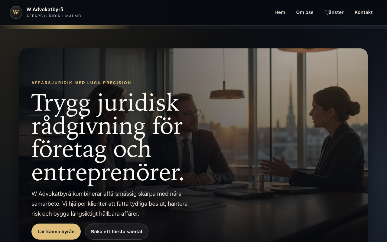
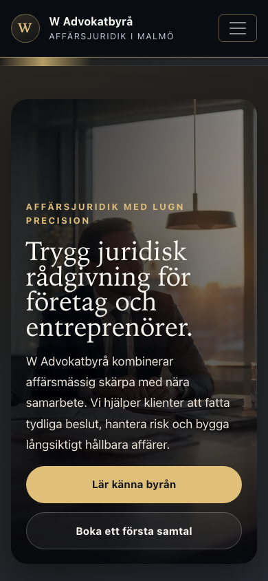
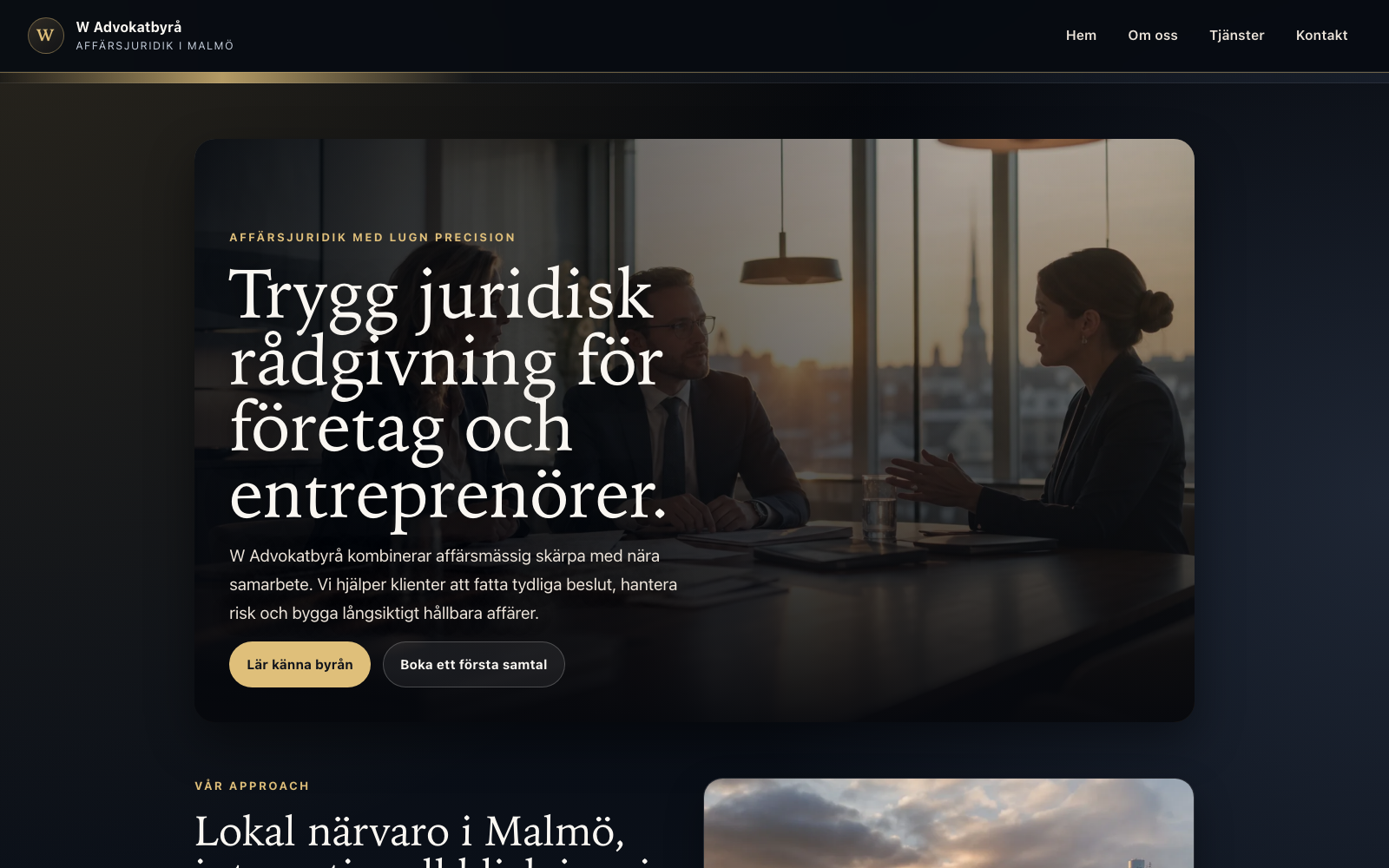
I practiced building for a serious brand: fewer distractions, stronger hierarchy, and navigation that helps a visitor understand services before contacting the firm.
About the project
This project simulates a professional law firm website. The goal was not flashy animation but credibility — clear service sections, readable typography, and a contact path that feels appropriate for legal services.
Outcome
A deployable demo I use to show UI judgment: when to keep layouts calm and content-forward.
What I focused on
- Service sections structured for scanning
- Contact journey kept short and obvious
- Mobile-friendly layout
What I learned
- Information architecture for service-based businesses
- Visual hierarchy that signals trust (spacing, headings, contrast)
- Responsive layout without overcomplicating the codebase
Tech stack
HTMLCSSJavaScript